Showing posts with label plots. Show all posts

Thursday, December 5, 2013

astroML: calling hist

If you're trying to use astroML.plotting.hist and it spits blood saying something like:
slice1[axis] = slice(1, None)
IndexError: list assignment index out of range

check the namespace: astroML's hist should simply be called as hist(data), whereas ax.hist() or plt.hist() methods are the normal Matplotlib's methods which choke from astroML's options.

Friday, April 26, 2013

Batch downloading SDSS image cutouts

I remember I've done that before, but couldn't find the script. Here is one I quickly put together, based on Min-Su Shin's code.

import os
import db
from utils import *

ids = db.dbUtils.getFromDB('id', dbDir+'MyDB.sqlite', 'mothersample')

for id in ids:
  id = str(id)
  ra = db.dbUtils.getFromDB('ra', dbDir+'MyDB.sqlite', 'mothersample', ' where id = '+id)[0]
  dec = db.dbUtils.getFromDB('dec', dbDir+'MyDB.sqlite', 'mothersample', ' where id = '+id)[0]
  name = "data/cutouts/"+id+".png"
  command = str("wget 'http://casjobs.sdss.org/ImgCutoutDR7/getjpeg.aspx?ra="+str(ra)+"&dec="+str(dec)+"&scale=0.5020920&width=150&height=150&opt=GS&query=&Grid=on&PhotoObjs=on' -O "+str(name)  )
  os.system(command)


Saturday, April 13, 2013

Matplotlib: plotting a bar plot with errorbars from data

This didn't make any sense for what I've been trying to do (a histogram), but might be useful someday:

y, binEdges = np.histogram(vel_22,bins=15)
errArray = np.zeros((y.shape))
for i, edge in enumerate(binEdges):
  vel_lo = np.where((vel_22 <= edge) & (vel_22 > binEdges[i-1]))[0]
  print np.mean(vel_err[vel_lo]), 'mean'
  if math.isnan(np.mean(vel_err[vel_lo])):
   errArray[i -1] = 0.
  else:
   errArray[i -1] = np.mean(vel_err[vel_lo])
width = 12
bincenters = 0.5*(binEdges[1:]+binEdges[:-1])
plt.bar(bincenters, y, color='white', edgecolor='k', width=width, yerr=errArray)

Tuesday, February 19, 2013

Matplotlib: strings as axis labels

I wanted to make a plot that shows the relation of some galaxy properties vs. their Hubble subtype. The subtypes were saved as strings at my database, I selected them, converted back to numbers. Why back? Because some colleagues of mine, who think in words, classified all the 900 galaxies by their Hubble types, then their classifications were converted into numbers, means and probabilities calculated, and converted back to types.
Anyway, I wanted to have types on my axis, so I did it thus. Here's the plot:

Matplotlib: colorbar too large

If the colorbar is too big, setting the 'shrink' property helps:

  p = ax2.imshow(image, cmap=cm.hot, interpolation='nearest')
  ax2.xaxis.set_visible(False)
  ax2.yaxis.set_visible(False) 
  cb = plt.colorbar(p, shrink=0.455)

Sunday, December 16, 2012

Matplotlib: errorbar throws a ValueError: too many values to unpack

I've been working on the errorbars in Matplotlib, and kept getting this error.
To avoid it, check your array dimensions: errorbar(), unlike scatterplot(), keeps on insisting on (x, ) error array dimensions.
1D arrays (vectors) in Numpy can be of shape (x, 1) or (x, ). That's usually interchangeable, but in cases like that, np.reshape(x, (x.shape[0], )) does the trick.
I think hope there is a deep underlying reason for that.

Matplotlib: zorder kwarg

One can pass zorder kwargs in order to change the depth preference of plots/errorbars/etc:
scatter_kwargs = {"zorder":100}
error_kwargs = {"lw":.5, "zorder":0}

scatter(X,Y,c=Z,**scatter_kwargs)
errorbar(X,Y,yerr=ERR,fmt=None, marker=None, mew=0,**error_kwargs )

Matplotlib: no edge for marker

"edgecolor = None" sets the point edge colour to the default value, which is black. "edgecolor = "none"" removes the border altogether. I can't stand stuff like this.

Sunday, November 25, 2012

Converting IDL color table to Python: Matplotlib colour map from rgb array

We have our own colour table, mostly used for kinematics or similar spatial plots. There was some Python code to access it (I think), but it used a look-up table, and didn't look concise enough.
M. from MPIA wrote a short IDL script that basically takes the rgb distribution vectors across the colour table length, interpolates it to 256 bins and creates a callable colour table.
I thought it would be easy to rewrite it. Matplotlib's documentation was quite incomprehensible. It uses a set of tuples to define a colourmap, which is neat and gives you a lot of control, but I had a different input of colour vectors, which was an array of pre-defined rgb values. colors.ListedColormap did the trick, so here is a script to make a custom colour map from a rgb array with matplotlib.

Friday, November 16, 2012

Seeing structure in the data: histogram bin widths

It's easy to lie with histograms. Choosing a small histogram bin width brings out spurious peaks and you can claim to see signal while there are only random sampling fluctuations. Choosing a large histogram bin width lets you smooth over the data distribution, hiding peaks or gaps (see an example using the Cauchy distribution here). Choosing slightly different histogram widths for two distributions you are comparing can lead to wildly different histogram shapes, and thus to a conclusion the two datasets are not similar.
This problem was sitting at the back of my head for quite some time: we are making interesting claims about some property distributions in our sample, but to what extent are our histograms, i.e. data density distribution plots, robust? How can we claim the histograms represent the true structure (trends, peaks, etc) of the data distribution, while the binning is selected more or less arbitrarily? I think the data should determine how it is represented, not our preconceptions of its distribution and variance.

I tried to redo some of our histograms using Knuth's rule and astroML. Knuth's rule is a Bayesian procedure which creates a piecewise-constant model of data density (bluntly, a model of the histogram). Then the algorithm looks for the best balance between the likelihood of this model (which favours the larger number of bins) and the model prior probability, which punishes complexity (thus preferring a lower number of bins).
Conceptually, think of the bias-variance tradeoff: you can fit anything in the world with a polynomial of a sufficiently large degree, but there's big variance in your model, so its predictive power is negligible. Similarly, a flat line gives you zero variance, but is most probably not a correct representation of your data.
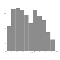
The histogram below, left shows our sample's redshift distribution histogram I found in our article draft. The right one was produced using the Knuth's rule. They might look quite similar, but the left one has many spurious peaks, while the larger bumps on the right one show the _real_ structure of our galaxies distribution in redshift space! The peak near 0.025 corresponds to the Coma galaxy cluster, while the peak at roughly 0.013 shows both the local large-scale structure (Hydra, maybe?) _and_ the abundance of smaller galaxies which do make it into our sample at lower redshifts.
Also consider this pair of histograms:
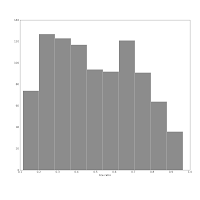
They show the axis ratio (b/a) of our sample of galaxies. The smaller this ratio is, the more inclined we assume the galaxy to be, with some caveats. The left one was produced using matplotlib's default bin number, which is 10, at least in Matlab after which matplotlib is modelled.I think are sqrt(n) or some other estimate.
The right one shows the histogram produced using Knuth's rule. It shows the real data distribution structure: the downward trend starting at the left shows that we have more inclined, disk galaxies in our sample (which is true). The bump at the right, at b/a = 0.7, is the population of rounder elliptical galaxies. The superposition of these two populations is shown much more clearly in the second histogram, and we can make some statistical claims about it, instead of just trying to find a pattern and evaluate it visually. Which is good, because we the humans tend to find patterns everywhere and the noise in astronomical datasets is usually large.

Tuesday, November 6, 2012

Matplotlib: XKCDify, bimodal Gaussians

I tinkered with xkcdify last night, it's a brilliant script. I learned something about bimodal Gaussians too (i.e. functions that are superpositions of two single Gaussians with sufficiently different means and sufficiently small standard deviations). The source code of the plot is here: https://github.com/astrolitterbox/xkcdify_plots. I modified the XKCDify script itself a little, the rotated labels looked somewhat ugly, when present on several subplots. Might be cool to set the text angle at random.
Someday I'll fork it and add the title and histograms.

Monday, November 5, 2012

Matplotlib: intensity map with hexbin

While looking for unrelated stuff, I found this set of matplotlib examples. This is going to be handy when I'm plotting the output of a spectra fitting tool next week.

Monday, August 27, 2012

Decent scientific plots with matplotlib

I think matplotlib is poorly documented and too object-oriented to be immediately usable. Trying to be too many things at once. Besides, the default values and default behaviour is kooky sometimes.
For instance, histogram bar widths: they are different for different datasets, and you cannot compare two distributions if that's the case. You have to resort to hacks like this:

  hist, bins = np.histogram(data, bins = 10)
  width=1*(bins[1]-bins[0])
And I think it's a bloody hack, calling histogram method from some other module in order to be able to call matplotlib's histogram plotting routine. Nevertheless. It's flexible and, since I already use Python to pull my data from databases, I decided to give it a try when I had to prepare some plots for a review poster.
So, what makes an ugly plot look decent? First of all, ticks:

      minor_locator = plt.MultipleLocator(plotTitles.yMinorTicks)
      Ymajor_locator = plt.MultipleLocator(plotTitles.yMajorTicks)  
      major_locator = plt.MultipleLocator(plotTitles.xMajorTicks)      
      Xminor_locator = plt.MultipleLocator(plotTitles.xMinorTicks)   
      ax.xaxis.set_major_locator(major_locator)
      ax.xaxis.set_minor_locator(Xminor_locator)     
      ax.yaxis.set_major_locator(Ymajor_locator)
      ax.yaxis.set_minor_locator(minor_locator)
They have to be set separately for each axis, I pass them as parameters from a wrapper class. Then, hatched bars.
Some parameters, redefining matplotlib's defaults (these plots are for printouts, so font sizes are big):

params = {'backend': 'ps',
          'axes.labelsize': 10,
          'text.fontsize': 10,
          'legend.fontsize': 10,
          'xtick.labelsize': 8,
          'ytick.labelsize': 8,
          'text.usetex': True, 
          'font': 'serif',
          'font.size': 16,
          'ylabel.fontsize': 20}
If you'd like to have different symbols (markers) in a scatterplot, this is useful:

      markers = itertools.cycle('.^*')
      p1 = ax.plot(gd.data[0], gd.data[1], linestyle='none', marker=markers.next(), markersize=8, color=gd.colour, mec=gd.colour, alpha = 1) 
But the double symbols in the legend, why is that? No sense.
I would not claim the plots shown are publication-quality (just look at slightly differing histogram widths). But they look way better than default plots one would get with matplotlib.

RGB colours in matplotlib plots

LaTeX accepts un-normalised (like 0-65-122) rgb values as colour arguments in, say, .cls files:
\definecolor{AIPblue} {RGB}{0, 65, 122}
matplotlib insists on getting something like that:

#colour settings
ASColour = '#666666'
or normalised (0 - 1) rgb values tuple. It's easy to normalise, but it's also easy to convert rgb values to hex.

Saturday, August 25, 2012

Generating matplotlib plots via ssh on a remote server

If you're running a plotting script via ssh, you're likely to get an error message of this sort:

_tkinter.TclError: no display name and no $DISPLAY environment variable
One possible solution is to use the Agg backend.

Friday, August 17, 2012

matplotlib: missing x, y axis labels

There must be some reason why it was so, but I had

plt.ylabel = plotTitles.ylabel 

instead of

plt.ylabel(plotTitles.ylabel)

in my pyplot wrapper.

Drawing a diagonal (or any arbitrarily inclined and offset) line in Matplotlib

I wanted to overplot a simple 45 deg line on my data. As far as I know, Matplotlib doesn't accept equations, only sets of points, so here's a clumsy solution to it, based on this:

    import pylab as pl
    import numpy as np
    x1,x2,n,m,b = min(data),max(data).,1000,1.,0. 
# 1000 -- a rough guess of the sufficient length of this line.
#you can actually calculate it using the Pythagorean theorem.
#1, here -- the slope, 0 -- the offset.

    x = np.r_[x1:x2:n*1j] #http://docs.scipy.org/doc/numpy/reference/generated/numpy.r_.html
    pl.plot(x,m*x + b); pl.grid(); pl.show()


Thursday, August 16, 2012

Image intensity scaling

I wanted to make some images, showing the output of the photometric analysis, i.e. the radii where the growth curves flattened, etc. scipy.misc.imsave() bytescales the image, so here's some documentation on image intensity scaling I'm currently digesting: how ds9's 'scale --> 99%' works: it's outlier clipping.